


.png)


.gif)


.gif)


My story
Aug 2024 – Nov 2025,
Remote
Inktech
Senior Product Designer
Jan – Jul 2024,
Remote
Freelance
Senior Product Designer
Oct 2021 – Dec 2023,
Hybrid
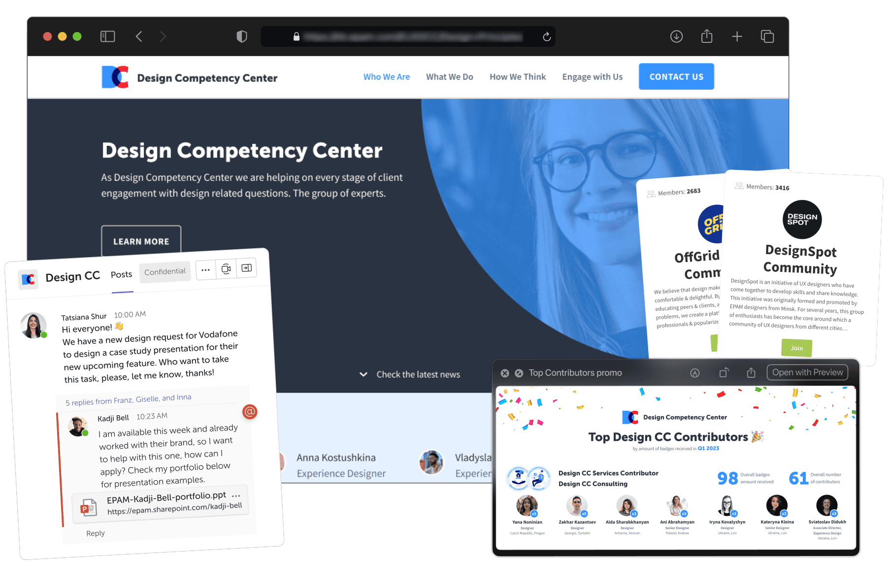
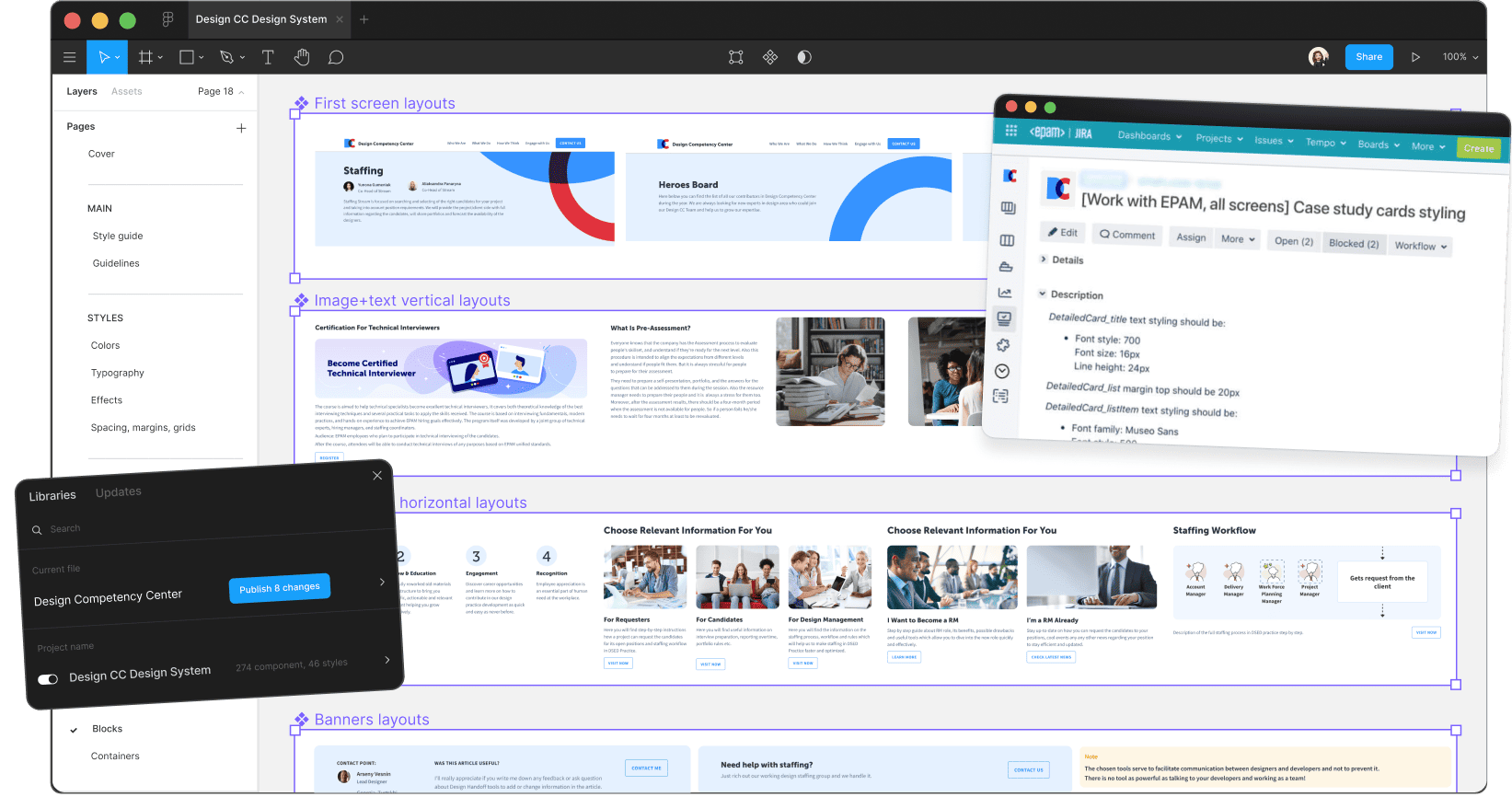
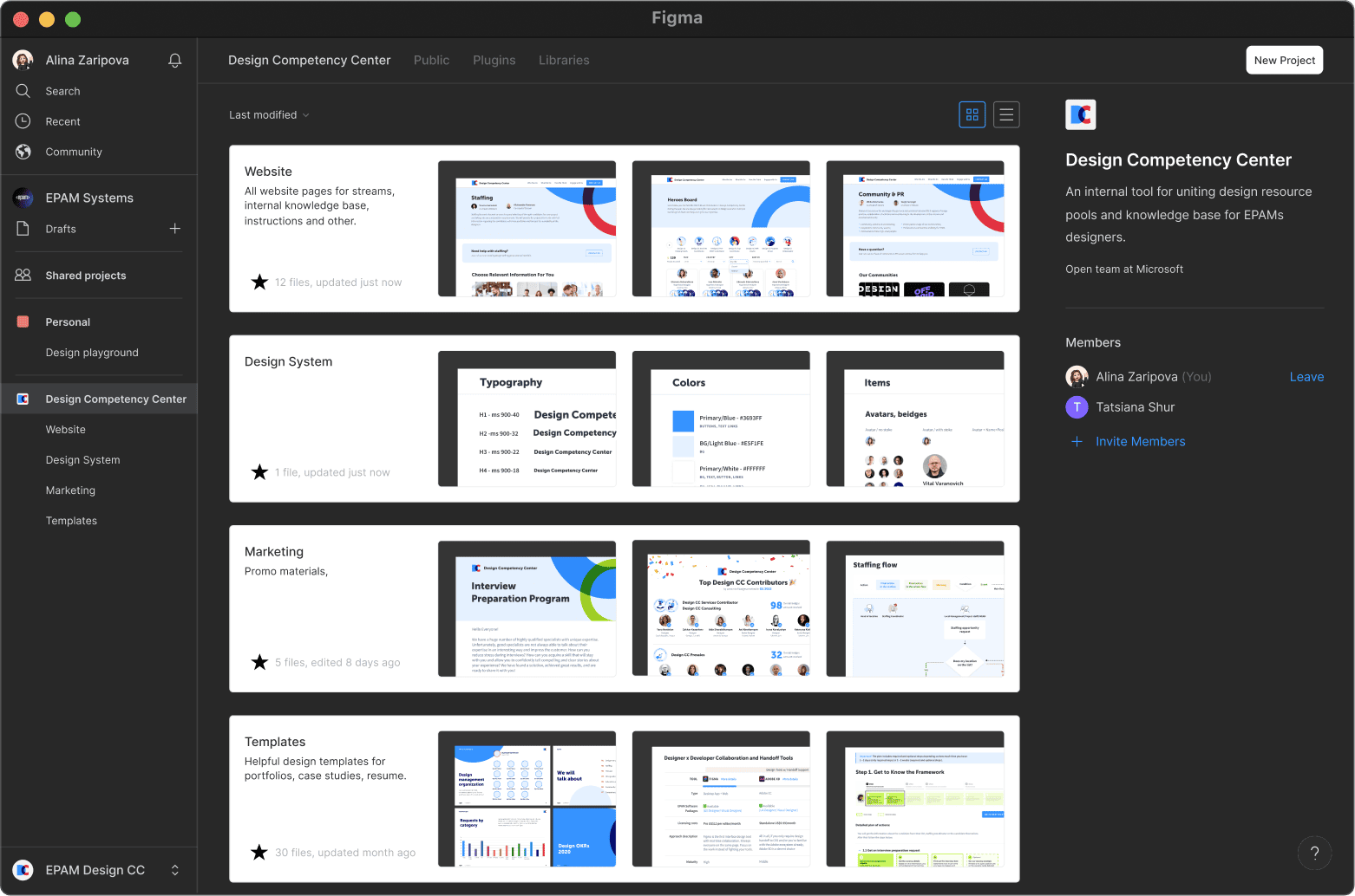
EPAM Systems
Senior Product Designer
Jan 2019 – Aug 2021,
On-site, Hybrid
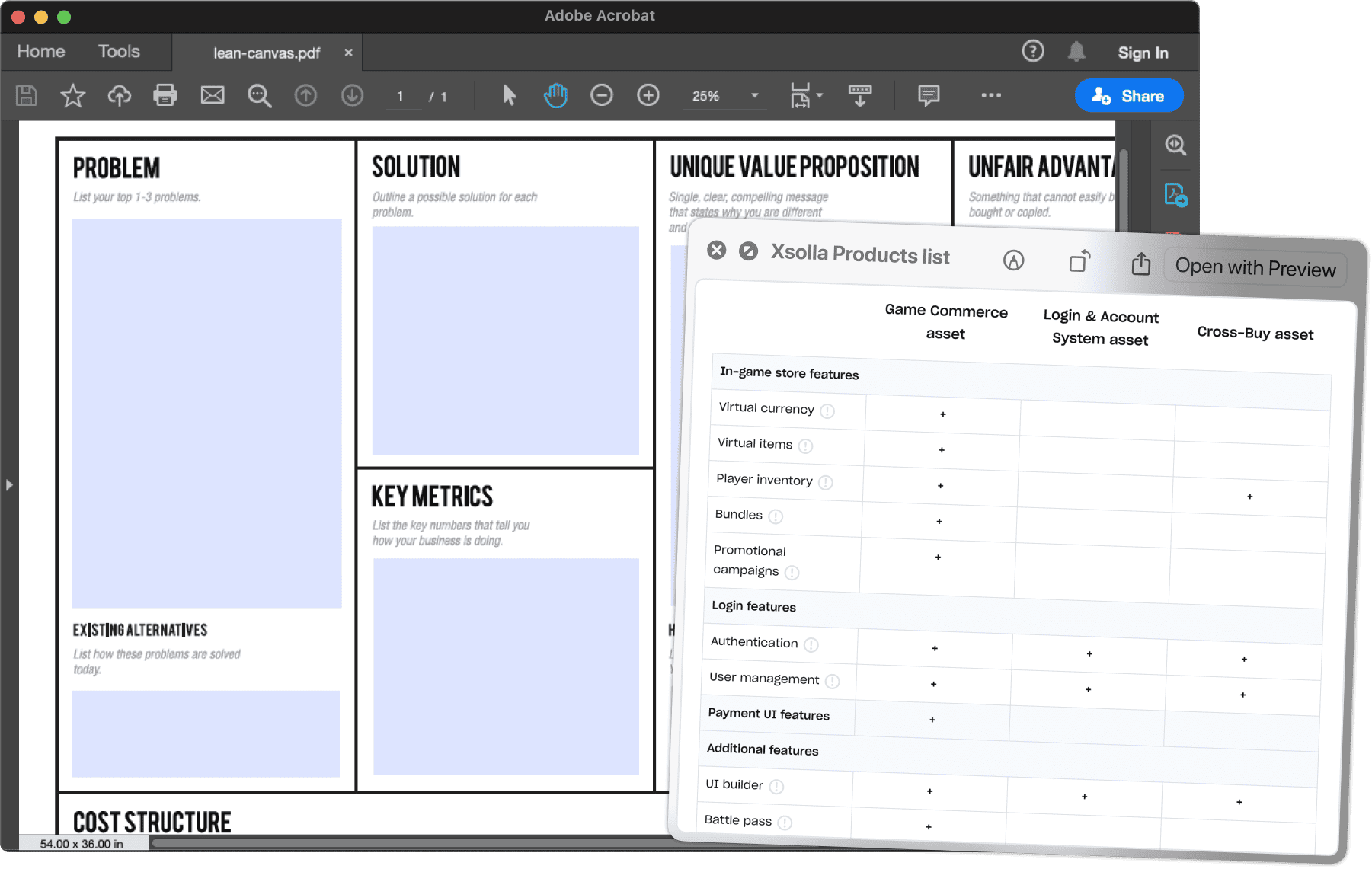
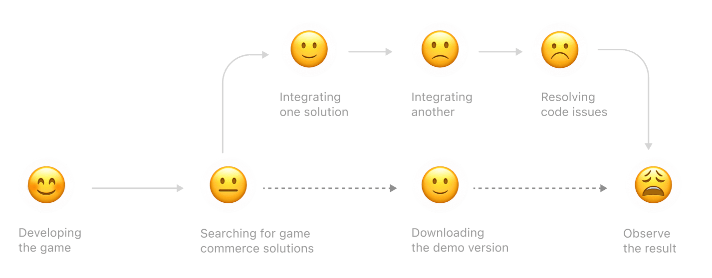
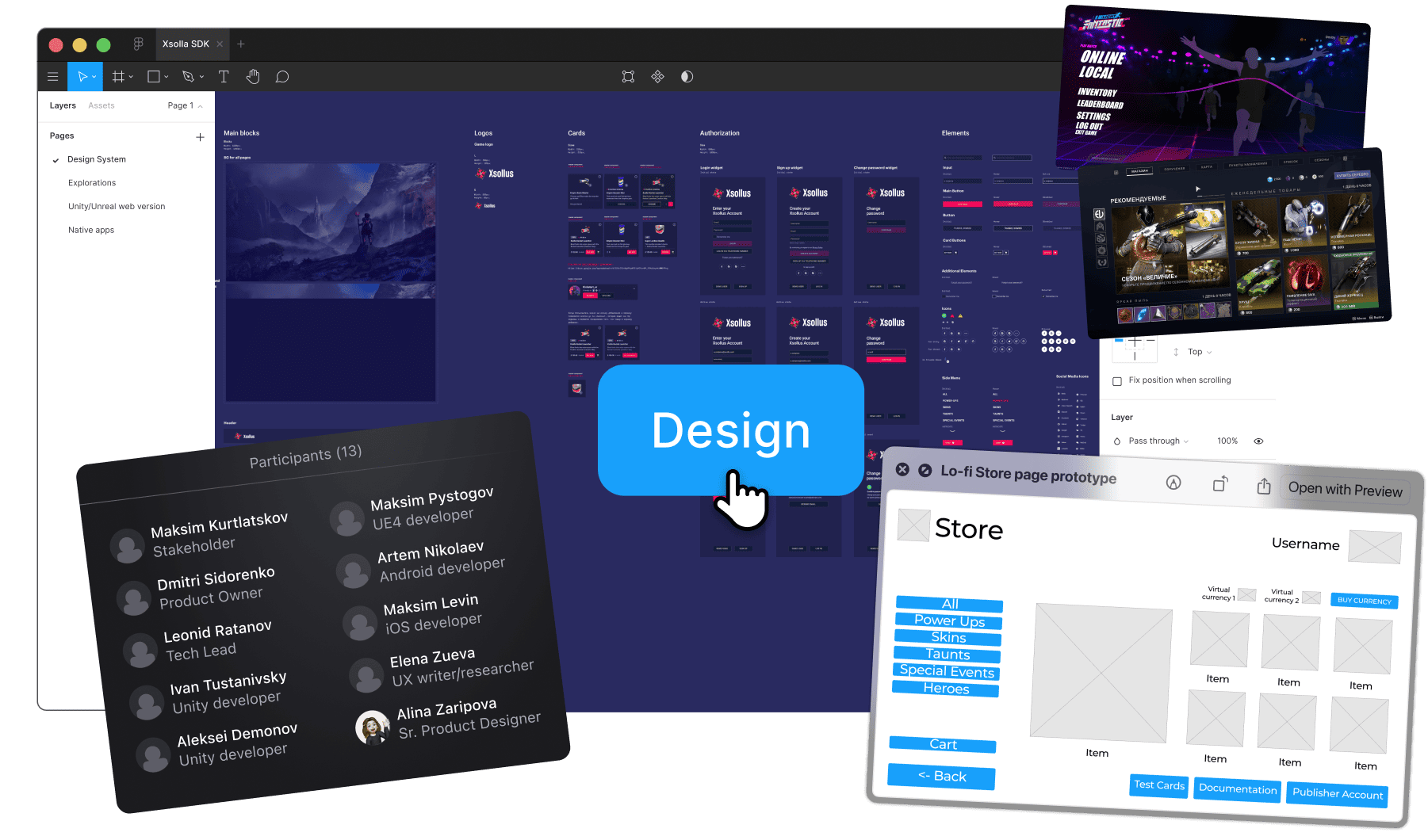
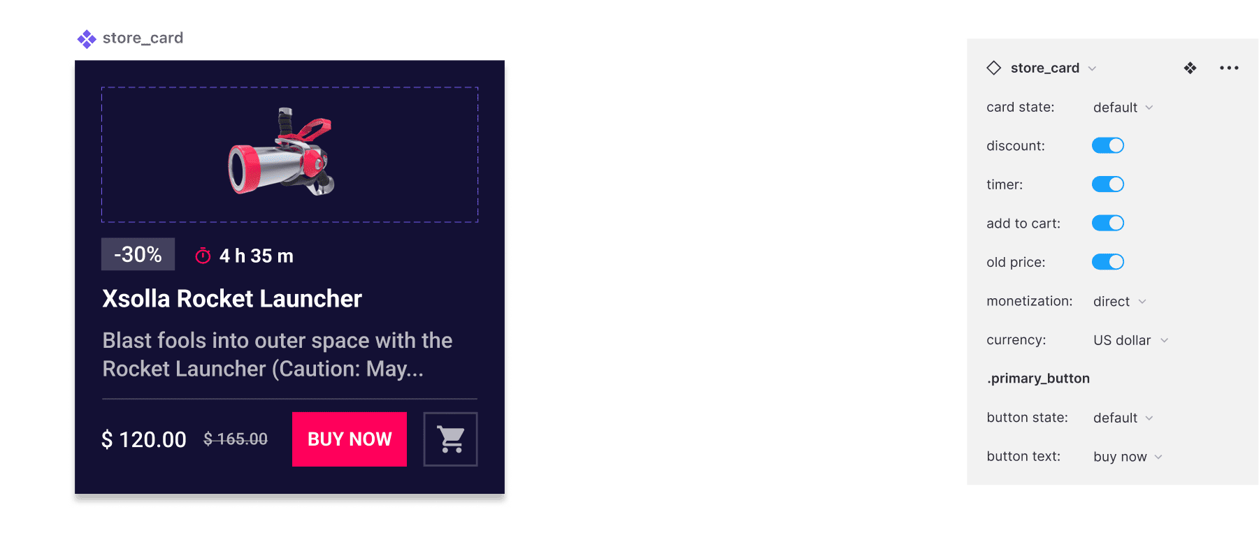
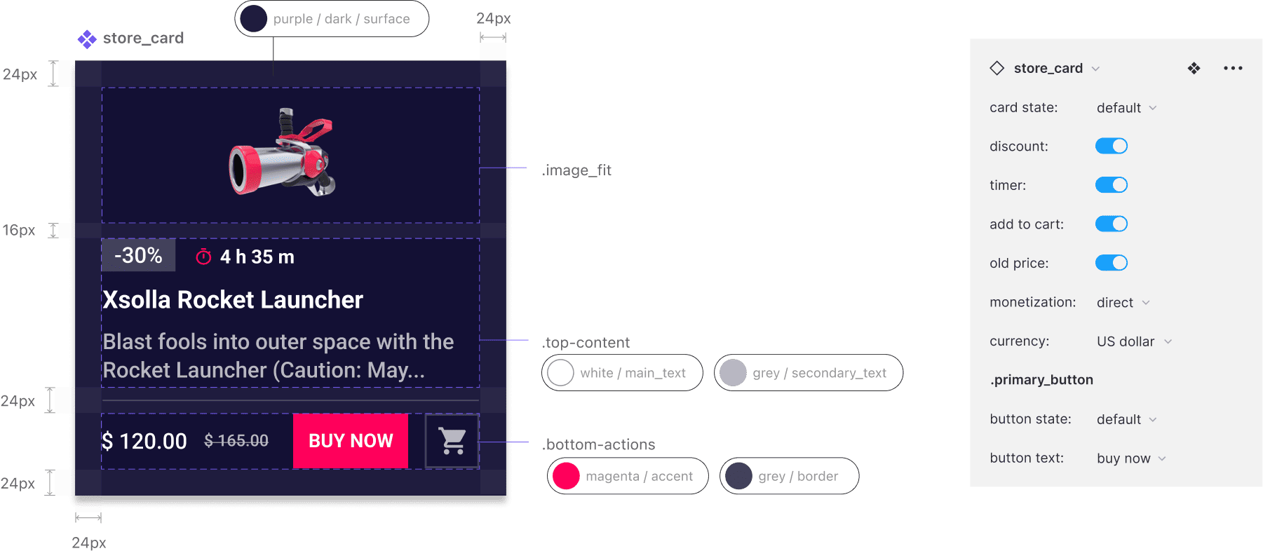
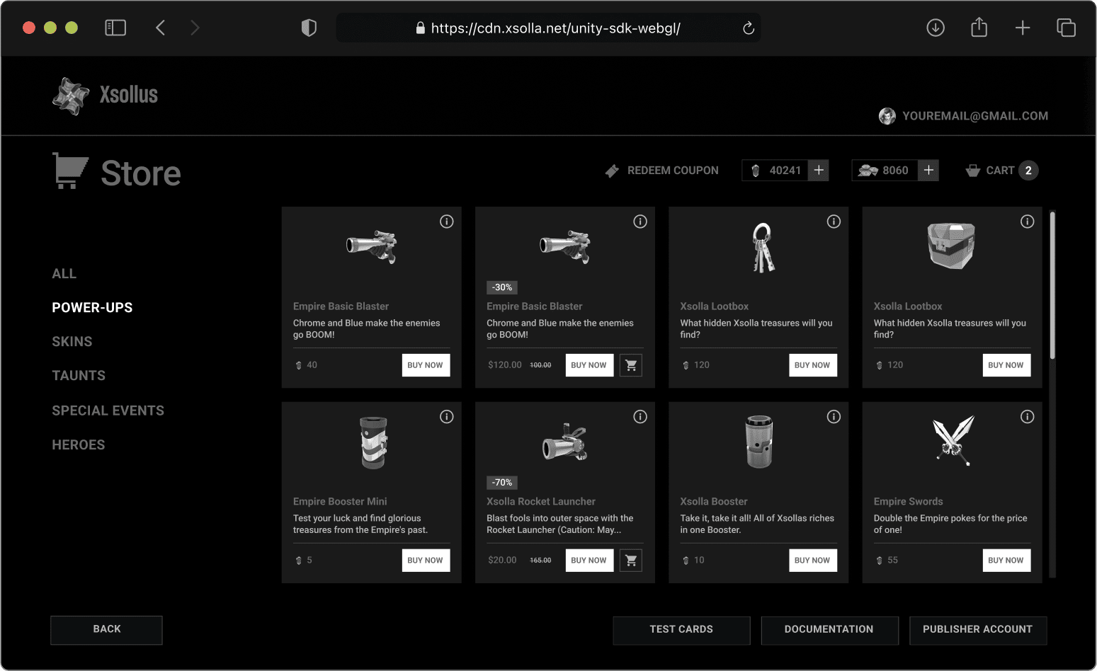
Xsolla
Senior Product Designer
Sept 2018 – Jan 2019,
On-site
ITMS
Middle Product Designer
Sept 2017 – Aug 2018,
On-site
Internet Projects
Product Designer
Jan – Aug 2017,
Remote
Freelance
Product Designer


