A light image from leftA light image right

Building a design system for EPAM Design Competency Center

2021–2023 · Design Systems
A EPAM Design CC design

In this case study, I would like to share my experience of renovating the existing design system of EPAM Design CC which helped standardize the product and also provide designers with reusable components to improve the velocity of their workflow.

I built processes, introduced new tools and laid the foundations of our new design system.
overview

What is EPAM Design Competency Center?
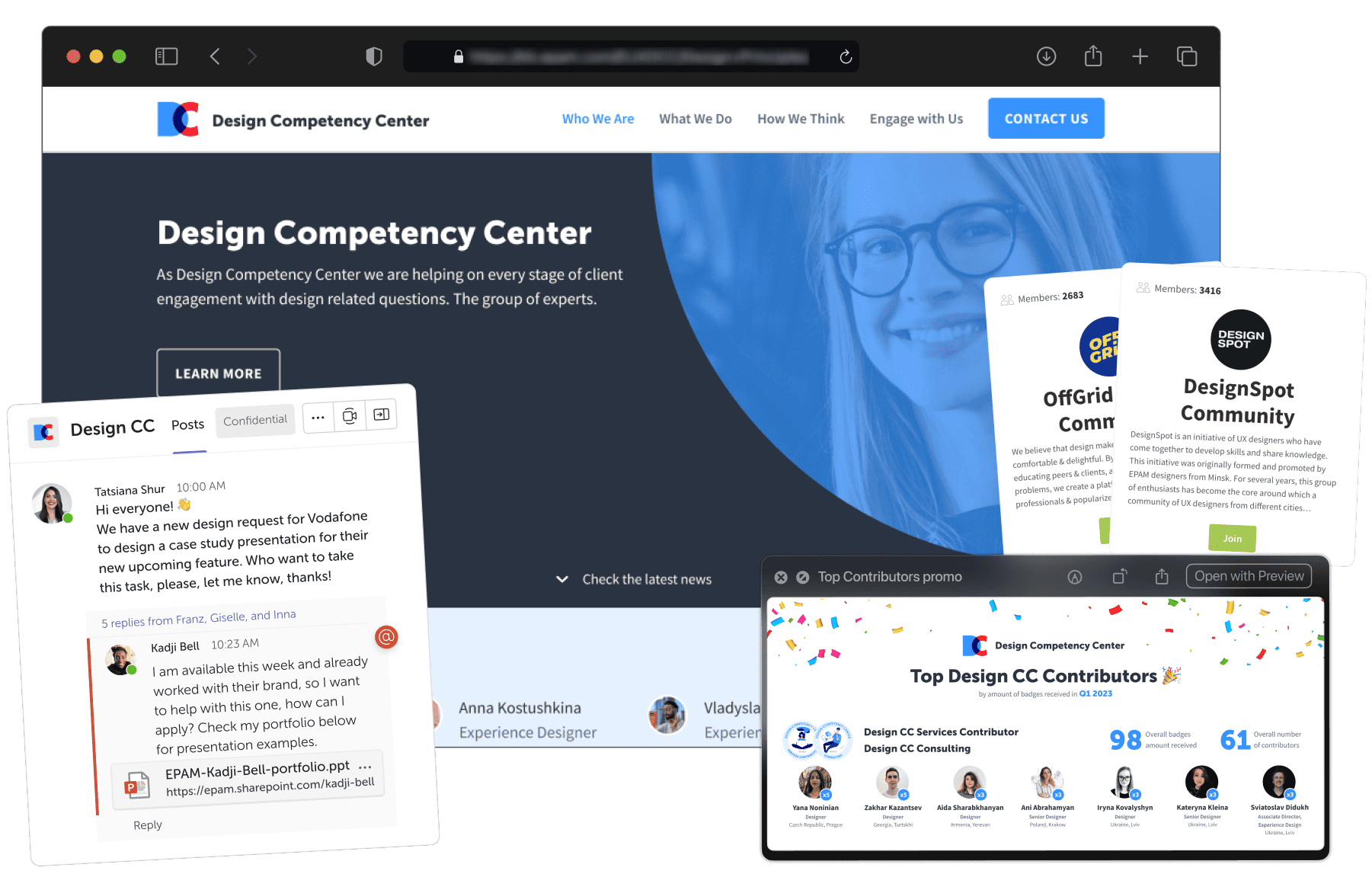
Overview
It is an internal organizational product used to coordinate designers in the whole company. Design Competency Center provides expertise for design projects or personal development, acting both as resource pools for multiple business areas and repositories of knowledge for EPAMs designers.
Within the EPAM, we also have many other competency centers for JavaScript, SAP and other.
Design CC in EPAM engages design talents and grows their expertise, as well as unites several design communities into one global group of experts across EPAM. It consists of about 10k designers in 35+ locations around the world. These are our end users.
background
At the beginning of Design Competency Center creation, there was only 1 designer, who designed the product and it's branding. The style guide he left was fragmentary, lacked consistency, and with a very few UI component elements. Additionally, there was almost no documentation.
A GIF showing percentage of different Design CC artifacts
statistics.gif
So in this case study, I want to talk about how I overcame the challenges I was facing when the product didn't have a design system. I will also talk about the process of building the design system.

Why did we need a design system?

brief
When I joined Design CC as a new Product designer, it was readily apparent that the product's design needed work. In addition to some spotted UX problems, I started to face challenges from an operational standpoint while designing any new feature, so I felt like creating a design system would be a logical place to try and make an impact. I wanted to make sure that I am focused on addressing user needs instead of wasting hours redrawing elements.
That's when I decided to start work on building the design system.
challenges
In 2021, Design CC started rapidly growing, generating and providing a lot of materials and not having a pattern led to a wastage of time and resources and as a result, UX got suffered. I told the Product Owner that creating a design language can significantly speed up the design process. It will allow me to concentrate more on the flow and logic of a new feature or screen than on visual design.
Thankfully, Design CC did have an existing UI kit set up in Figma. On the other hand, it was readily apparent that a number of aspects needed work. Some elements were simply frames and not components, relatively few components were leveraging Figma’s variant feature, and while our official grid was set up as being an 12-column grid, not all components were suited for this. And almost all design artifacts was contained in a single page.
A screenshot of old UI Kit with very few elements
old_uikit.webp

Therefore, the business has set an inspirational goal:

Create the design system, that provides consistency and contains set of all standardized design elements that help teams to collaborate, design and develop faster and more effective.

Tatsiana Shur

Product Owner of
EPAM Design CC ↗
my role
As the Design System Designer, I worked mainly with Product Designers, Product Owner and the developers team.
I took the responsibility to audit the existing UI components, including typography, colors, and other elements to design them as a library that consists of reusable and customizable components which can be used by other product designers in future.

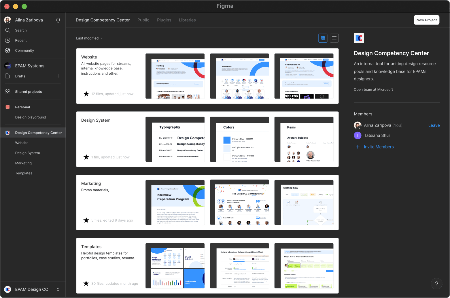
Updating the design system

the process

Working as a solo designer meant I had limited time to spend developing the Design System alongside other rapid UX work. The Design System had to scale fast, as I was discovering new use cases and constantly rethinking and expanding the library, so I had to approach this challenge strategically.

So by creating an updated centralized design system, I aimed to:

Icon Blur background imageAn icon showing consistency across channels
Improve

Brand perception through consistent designs that work across channels

Icon Blur background imageA Figma component icon
Create

A ready-made library for teams to create and test designs much faster

Icon Blur background imageA documentation guide book icon
Give

A structured and guided documentation on how to build Design CC product

The plan was next:

  • 📝 Perform an audit of the elements across the product
  • ✨ After, structure the components library
  • 🚀  Then, conduct education and testing sessions for designers
  • ⌛ Last, publish the final documentation
GIF showing Figma design system progress
figma_progress.gif

UI audit

Finding structure amidst the chaos

To better understand the current state of our existing design ecosystem, I started with a UI Inventory of our interface components. I conducted a 1-week audit and prepared the full list of elements and their usage across the product. Next week I've organized a number of prototype usability studies, as well as other discovery exercises. These helped me to drive the development of the component library and interaction patterns.

A Notion screenshot of design components audit table with statuses
notion_page.png
ux research
Another consideration before preparing the scalable components was to research of the real data use. During this stage I wrote down major real data values where possible. This will minimize the risk of running into difficult “what if” roadblocks in future and make component library real-to-life, flexible and adaptive.
Here are the points I identified:
  • 1.
    What if the titles go over 1 line?
  • 2.
    What if a there is no image? What a placeholder will look like then?
  • 3.
    What if a text description has a >3 lines?
This real data will allow me to address the real world scenarios for the design system later on.

Atomic design

Creating design foundation
I started with the atoms. They are consisting of colors, typography, grids, styles, shadows, and icons. So one of my first tasks was setting the Figma local styles, aiming to encapsulate a modern, vibrant brand while also taking into account the end users.
A list of fonts and colors used in Design CC brand
typography_colors.png
First things first
I started with typography and collected all text styles with font names, sizes, weights and other characteristics.
Next: the colors. Separating and dividing them on primary, secondary and accent on the basis of their usage property.
Here in this product, for example, blue is the dominant color, so it will contain different shades for covering use cases.
Websites, presentations and other materials not only contain text but also icons in different pixels.
A screenshot of local styles with icons and emojis used in Design CC brand
icons.webp
A system within a system
Having defined a basic system for colors, typography and spacing, I then moved on to the most basic elements such as buttons, inputs and forms since these would be the building blocks that make up more complex components and flows.
Taking a button as an example, I used our typography styles for the text, our color system to define the colors for every state and spacing presets to make sure everything could scale to different texts.
Build components
atoms.png
Component library
Variant set and auto-layout are relatively new features in Figma, both introduced in 2020. This might explain why it was not yet incorporated in to the Design CC old design kit. I remade all components, incorporated auto layout and variants.

Once I set up the components into reusable combinations of that address common user objectives with sequences and flows, I started to create variations on each component layout variations such as image left, content right or vice versa.

A components setup
components.png

Each component received stepped interaction examples so that expected interactive states are clearly communicated. These are paired with detailed specifications around tab stops, keyboard control requirements, spacing, atom and molecular elements.

Every component is further refined for additional breakpoints as well as minimal and maximum content specifications. This allows for content authors to know the maximum or minimum amount of content any given component can contain.

building Patterns

Patterns are used to show reusable combinations of components that address common user objectives with sequences and flows. These were developed in consideration of our global market rollout approach. While not every possible pattern was developed, this documentation served as the basis for our customers most common needs.

A screenshot of components built into layouts
blocks.png

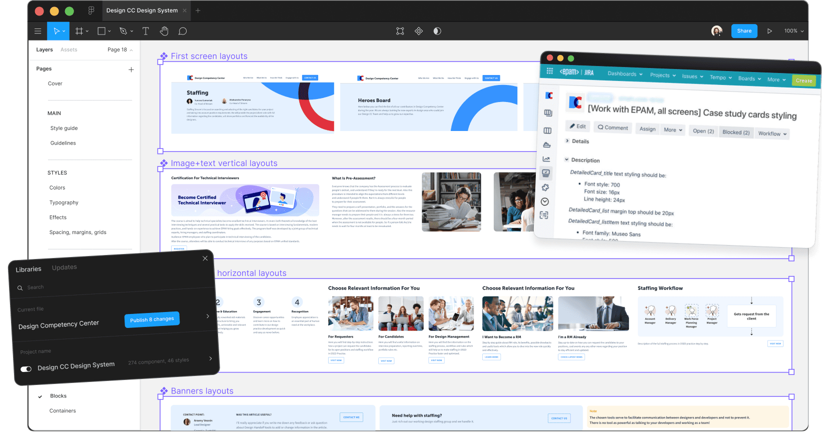
Design hand-off & build

documentation
I knew that documentation and governance around brand implementation into our design language was going to be the key to the success and sustainability of the system in the future.
So next, I created the Design System Confluence space and working closely with our content author and developers – I wrote and maintained documentation resources in the KB pages, ensuring that we included our design principles, patterns, component library, as well as quick start guides, accessibility standards and best practices for designing and testing.
A screenshot from Confluence page with Design principles
kb_documentation.webp
design hand-off
The handover notes are the instructions for developers on writing the code for the component. The handover document begins with the anatomy of the component, then includes its variations.
The Design CC system handover documents also included design tokens. Becoming increasingly popular in large-scale design systems, design tokens are pieces of platform-agnostic style information about UI elements, such as color, typeface, or font size. With design tokens, a designer can change a value—indicate that a call-to-action button should be blue instead of orange, for instance — and that change will populate everywhere the token is used, whether it is on a website, presentation, or banners.
A design handoff example with search bar specifications
handoff.webp

Results

insights
Working on our design system has been very challenging, but it has brought about many positive benefits for the product on different levels.
For of all, it simplified the life of developers. Speaking one language with the design team when discussing implementations. Focus on the feature not the low-level UI primitives (color & space values, small components, interactions, states, etc).
Second, having a ready-to-use library of components made creating high-fidelity interfaces a straightforward task by bringing designing interfaces from days to a couple of hours.
A timeline showing old 5-day task completing and now less than 1 day
timeline.webp
analytics
And the last, but not least, the design system allowed me to quickly build prototypes, test more ideas than before, quickly evaluate the hypotheses, and even create more variations to A/B test.
The points mentioned above are all related to internal aspects of the product, whereas the sought impact can be seen in the improvement of our user experience, and here are the results of how Design Competency Center increased its users rating, leading to new design tasks, leads and contributors.
A 3-year statistics of Design CC brand rating
rating.webp
outcomes
I determined that every component should sit within its own file. “Most of the time, you’re working on one component at a time. If you put all the components in one file, it slows down Figma. By giving each component its own file, it’s quicker to open and you have the whole history and documentation in one place,” I said.
For example, the files in this Figma design system document the life cycle of each component, pattern, and foundational element of the Design CC website, marketing and templates including the past and current iterations.
A screenshot of Figma space with all design files of Design Competency Center
figma_space.webp
Reflections
In under two months since starting the role, I completed the new Design System, which played a key role in boosting the products metrics. It played a crucial role as:
  • 1.
    It provided a cohesive look and feel for the brand
  • 2.
    As well as gave me a structure and a set of principles to return to when making decisions on sometimes conflicting requests from the wider team
  • 3.
    It streamlined the design process, which was key for a solo designer
  • 4.
    It led to a faster design to market time, providing developers with a single source of truth and a set of reusable components and patterns